
ROVIO: UNANNOUNCED PROJECT
This project was heavily inspired by UPA Style, playing with distorted perspective and exaggerated proportions mixed with influential artists such as Bonnie Liu and Eyvind Earle. This was my first time experimenting with the look however I hope to shed light on some of the feedback received and how I was able to develop more as an artist.
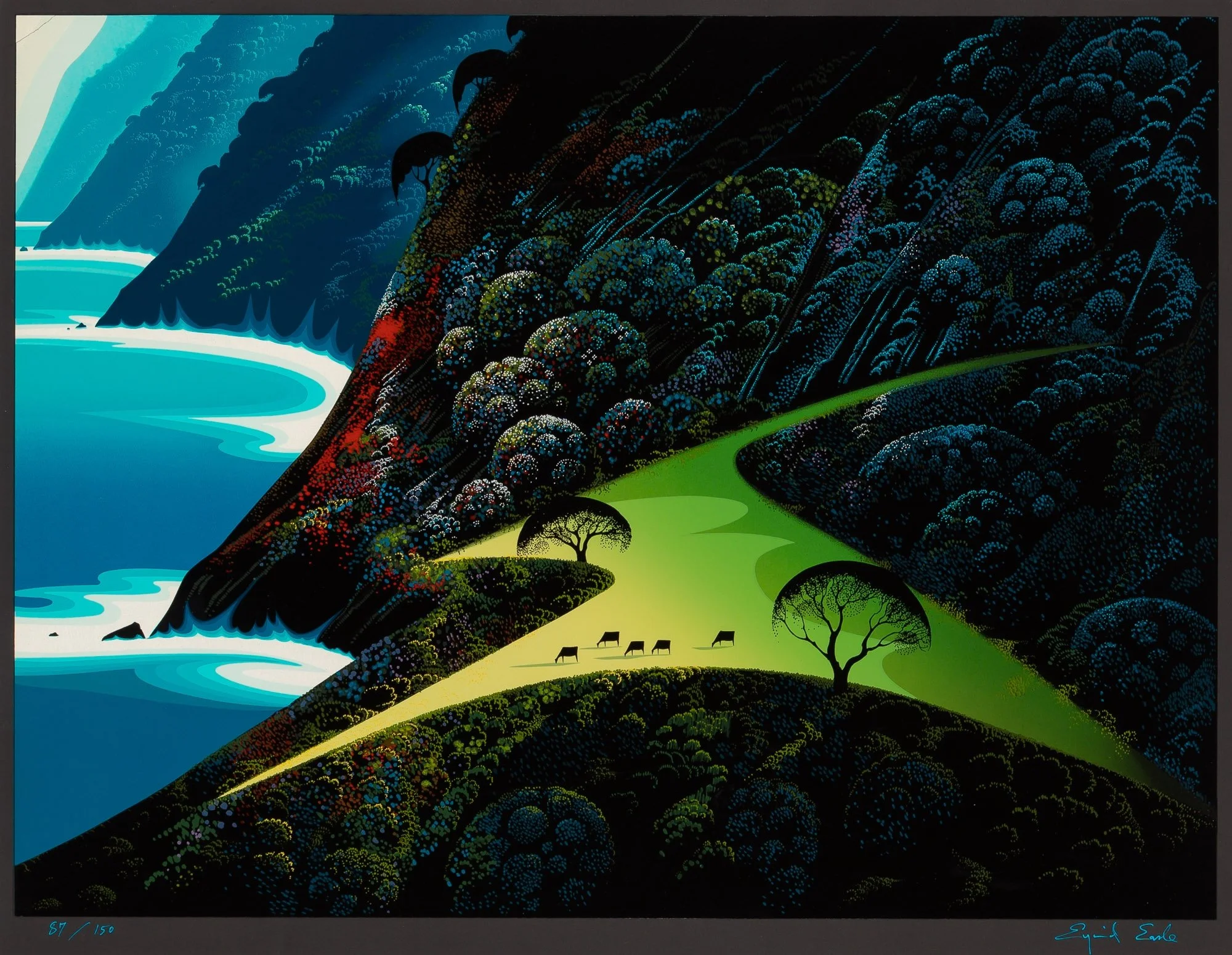
UPA Style Work


Eyvind Earle and Bonnie Lui


SUNFLOWER CONCEPT


Reference: Yvan Duque, Kevin Dart
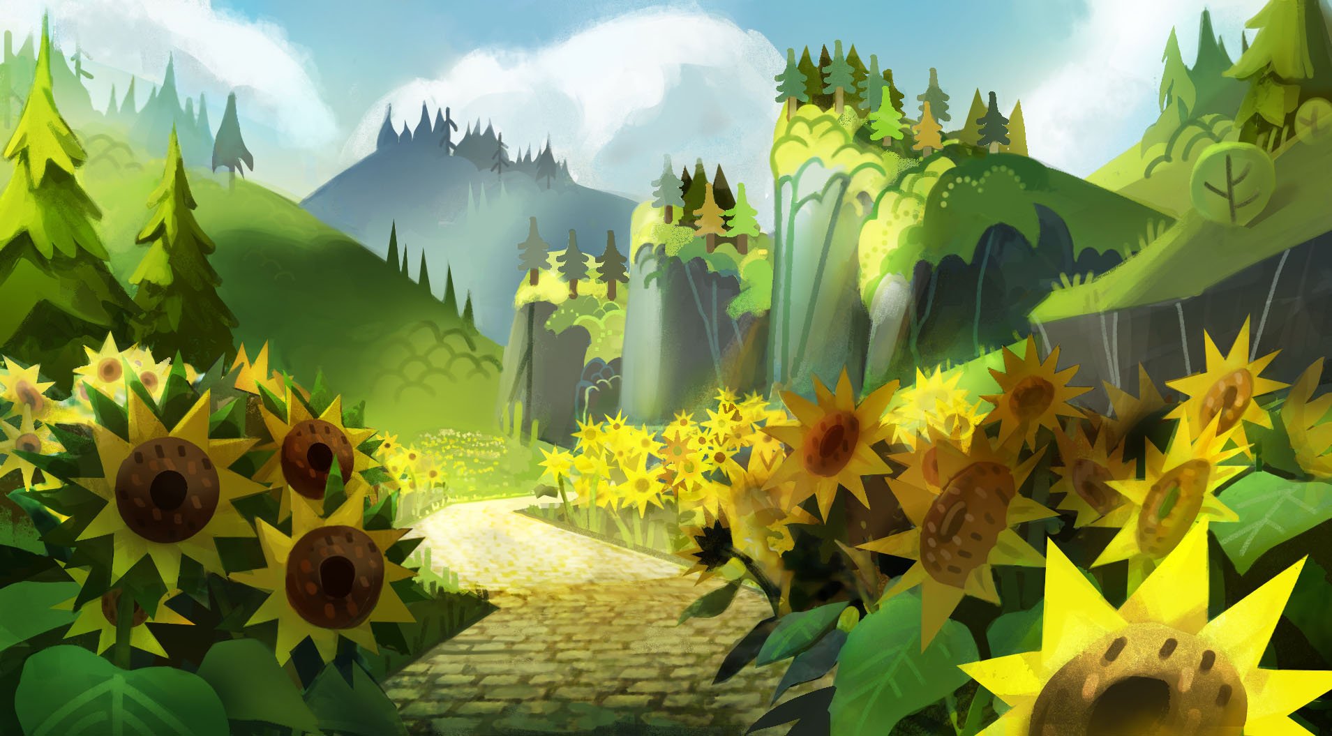
Sunflower Painting Feedback and Findings*
This image was inspired by the stylization in Yvan Duque’s work and the lighting in Kevin Dart’s work. As I was experimenting with full environment concept paintings to help show the rest of the team, I focused on establishing the rules of stylization in this piece which was crucial for future pieces and testing out the viability of creating them in 3d.
The Challenge:
At first I photobashed a bunch of sunflowers and broke them down in to simpler shapes. However after receiving feedback, there was a need to make them more geometrical shapes, hence I started simplifying the shape. Often what I thought was simple enough could have went further in simplification. With styles like this, think about breaking down the basic shapes, circles, triangles and squares and how they can come together to make the sunflower. Thinking about curves can already complicate the shapes, and should be left for focal points.
When creating rules, consider the spacing between objects. The same tree should look different up close than in the distance , but still recognizable. Yvan Duque's work lacked examples of this, especially with the trees, which became a new problem to consider after receiving feedback. Our style mostly imitated other stylized references we found, with personal taste guiding any necessary adjustments.
It's essential to mention that this wasn't just a flat color painting following the UPA style. The art director wanted to add atmosphere and realistic lighting to fit the 3D console game. As the concept artist, it was crucial for me to communicate this early on, especially because we aimed for the 3D artist to recreate the scene and demonstrate to the management that this art style was suitable scope for our team.
WATERFALL CONCEPT


Reference: Summer, Jane Newland
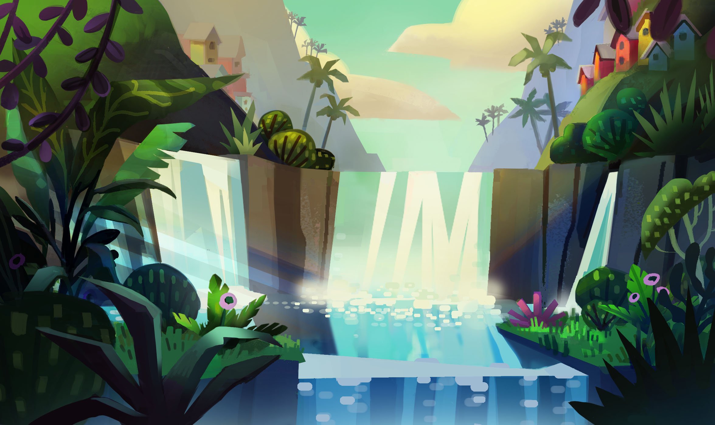
Waterfall Concept Feedback and Findings*
Trying out various plant designs from different sources was really fascinating. The feedback taught me to repeat similar shapes in my artwork, not just in this piece but in others too. I mainly thought about the different plant shapes and what kind of plants would appear in this environment.
As an artist who hasn't painted much foliage before, I learned how to paint it more efficiently by using the lasso and gradient tools. I also used dappled light in the front to show a big tree or plant partially blocking the sunlight. When painting the leaves, I focused on their grouped shapes rather than each leaf individually.
Questions in my head:
What sort of trees are in the foreground and how do they affect the environment lighting?
How can I point the lighting towards the focal point and simplify shapes in the background to make it less focused on plants the foreground?
How do I make the waterfall look like its splashing but at the same time reflecting light?
Here is just a little taste of what I’ve learnt from the project. A lot of these notes were feedback provided by the art director and I noted all of them down in an organized fashion to document the things we were working on together. I strive to continue to do this type of documentation for every client I work for. Please don’t hesitate to ask more in depth about some of the pieces. For more portfolio pieces and prospective clients, please contact me for the password for the WORK PORTFOLIO.
*NOTE: Characters have been removed for NDA purposes.